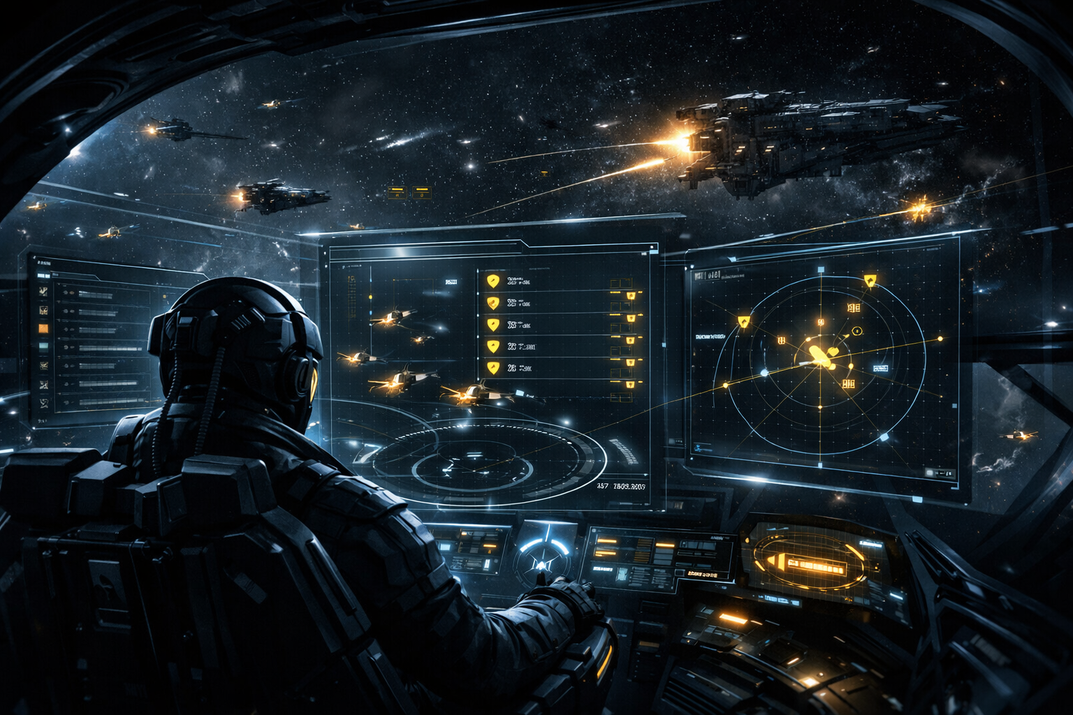
EVE Online Overview 2026: The Combat UI Setup That Keeps You Alive
Most pilots do not lose ships because they had no information. They lose ships because the right information was buried under junk when it mattered.
That is the real problem with a bad EVE Online Overview 2026 setup. Weak filtering slows target recognition, hides danger inside clutter, and punishes you the moment panic starts. This guide breaks down the overview logic, EVE UI customization choices, and survival-focused decisions that help you react faster, warp cleaner, and make fewer expensive mistakes.
Watch the Video
The Loru Gaming overview is useful as a starting point because it gives players a working baseline fast. But copying a profile is only step one. This article focuses on why the setup works, where pilots still sabotage themselves, and how to adapt it for real grid awareness.
Why This Matters in EVE
A strong overview is not just a convenience setting. It is one of the most important EVE Online survival tips because it decides what your brain notices first when something goes wrong.
In practice, your overview shapes target priority, escape speed, intel processing, and even whether your D-Scan catches the ships that matter. That is why this topic goes beyond importing a profile. Good EVE UI customization reduces hesitation. Bad customization creates hesitation and then charges you for it in destroyed hulls.
The Dual-Window Meta Fixes Tunnel Vision
The biggest improvement most players can make is abandoning the single-window mindset. One overview window cannot serve travel, PvP, drones, fleet utility, and emergency movement equally well. Trying to make it do everything usually means it fails when pressure hits.
A better approach is separating hot data from warm data. Hot data is what you need in the moment: hostiles, drones, tackle threats, and immediate combat decisions. Warm data is what supports movement and routine navigation: gates, stations, celestials, and route flow. Splitting those roles across two windows keeps combat awareness visible even while you handle something else.
This is where many losses begin. Haulers switch tabs and lose sight of hostiles. miners tunnel into utility windows. roaming pilots technically have the overview open, but not the right overview for the problem in front of them. Two windows do not make the UI prettier. They make it harder to die stupidly.
The GTFO Tab Removes Panic From Your Escape
A dedicated GTFO tab is one of the highest-value changes you can make because it removes bad choices before panic starts. When danger lands on grid, you do not want a giant wall of stations, wrecks, structures, and gates competing for attention.
You want clean warp options. A planets-and-moons-only tab gives you exactly that. It narrows your escape choices to fast, usable celestials that are often safer than instinctively warping to the most obvious gate or station.
The deeper lesson is that survival should be pre-built into the interface. Most bad escapes are not caused by slow hands. They are caused by a UI that forces you to think too much at the worst possible time.
Your “All” Tab Is Probably Outdated
A lot of pilots trust the “All” tab because the name sounds complete. That trust is often misplaced.
The problem is that “All” does not always stay meaningfully complete as the game evolves. New entities, ship groups, or NPC categories can slip past older filter logic. That creates a dangerous kind of false confidence: the belief that if something mattered, you would definitely see it on grid.
A smarter habit is treating the “All” tab as a maintenance item. Review it. Search for missing groups. Update it when the game changes or when your activity changes. An overview is not finished just because it once worked.
Visual De-Confliction Speeds Up Real Target Selection
One of the best changes in a modern overview is visual de-confliction. The goal is to make the important part of each line stand out before you consciously read the full entry.
That is why distinct ship-name formatting matters. When hull types are easier to spot through color, bolding, or underlining, the overview stops feeling like a blur of identical white text. It starts functioning like a threat hierarchy.
This matters in both solo and fleet play. You do not need beautiful typography. You need to recognize a dangerous hull faster than the other ship can punish your hesitation. Good formatting improves target calling, reduces misclicks, and helps newer players build threat recognition faster.
EVE D-Scan Settings Need Real Tabs, Not Half-Saved Ideas
A lot of players think their D-Scan is configured because the filter seems to exist on one client. That assumption is exactly how inconsistent setups happen.
The important technical point is that EVE D-Scan settings work best when the filters are tied to real overview tabs. If a filter matters, it should exist physically in your overview structure. Otherwise you risk rebuilding a client, swapping machines, or logging into an alt and discovering your scanning setup is incomplete when you actually need it.
This is one of the least glamorous but most important EVE Online survival tips in the whole guide. D-Scan is only useful if it is reliable under pressure. Treat those tabs like infrastructure, not decoration.
Cleaner Intel Starts With Background Priority
Many players overload chat with visual noise and then wonder why intel feels muddy. That is backwards.
Chat should stay readable. The overview should carry more of the urgent visual weight. Strong background highlights for neutrals, hostiles, or other risk categories make the dangerous entries pop where they matter most: on grid, in movement, in context.
This is really about information placement. Put urgency where action happens. Let chat handle flow. Let the overview handle alert value. When those jobs are separated properly, both tools become easier to use.
Fix Appearance Priority Before It Creates Friendly Fire
Appearance order is not cosmetic sorting. It is decision logic.
If suspect, criminal, militia, alliance, and fleet states sit in the wrong order, your UI can label a friendly like a threat or bury a meaningful relationship under a temporary warning state. In faction warfare or mixed-standing environments, that is how bad shots happen.
The fix is simple but important: move alliance, fleet, and militia recognition above lower-value status flags when your activity depends on friend-or-foe clarity. The interface reads from the top down. If the priority is wrong, your judgment is wrong a fraction of a second later.
Route Optimization Still Matters More Than Players Think
Not every useful UI improvement is about combat. Some are about removing waste from the rest of your playtime.
Route optimization is a perfect example. When players stack waypoints manually and never optimize the route, they often fly the order they entered rather than the shortest practical path. That means extra jumps, extra time, and sometimes extra exposure for no benefit.
On one trip, that feels small. Over weeks of hauling, staging, market runs, and logistics, it becomes a steady tax on your efficiency. Good pilots do not just fit ships better. They also reduce the friction caused by the interface around those ships.
Quick Checklist for a Safer Overview
- Split combat tabs and navigation tabs into separate windows.
- Build a GTFO tab with planets and moons only.
- Audit your “All” tab instead of assuming it includes current threats.
- Make ship hull names visually distinct enough to read at a glance.
- Save critical EVE D-Scan settings as real overview tabs.
- Use background highlights for neutrals and hostiles where urgency matters most.
- Reorder appearance priorities so friend-or-foe logic beats temporary flags.
- Optimize multi-stop routes instead of trusting click order.
The Strategic Layer
The real value of a better overview is not that it looks cleaner. It changes your decisions under pressure.
Players make worse choices when the interface demands too many micro-judgments at once. That is the hidden cost of clutter. You hesitate, reread a line, click the wrong object, or warp to the obvious destination instead of the safe one because your overview made the fast choice the bad choice.
This is why overview design belongs in the same conversation as risk management, piloting discipline, and EVE Online survival tips. Every tab, highlight, and priority rule affects how quickly you understand the grid. And in EVE, delayed understanding is just another form of damage taken.
The biggest mistake players make after importing a profile is assuming the work is done. A copied setup is a baseline. The real advantage comes from understanding the logic, trimming what you do not need, and making sure your EVE UI customization reflects the content you actually run.
Related EVE Guides
- The Complete Guide to D-Scan Mastery
- Pochven Navigation for Beginners
- Multi-Boxer UI Sync and Overview Management
Conclusion
The best EVE overview setups are not the ones with the most tabs or the flashiest color choices. They are the ones that reduce decision time when the grid gets messy.
That is the standard for a strong EVE Online Overview 2026 setup. Every filter, color, tab, and window should answer one question: does this help me identify danger, act faster, or avoid a stupid loss? If not, it is clutter. And in EVE, clutter kills just as reliably as hostile guns.
Save this guide for your next UI rebuild, and explore more EveExplorer guides before your next expensive mistake.